0161 312 1800
enquiries@segaris.co.uk
theblack&whiteagency
Work/High Growth Foundation Website
Client: Winning Pitch
Sector: Business Development
Services Used: Brand & Identity, Packaging Design & CMS Website
Website: www.highgrowthfoundation.co.uk
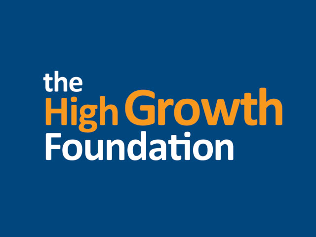
Brief: High Growth Foundation needed a logo and brand that could be developed into a national brand. They also needed a series of secondary logos to support other areas within the business.
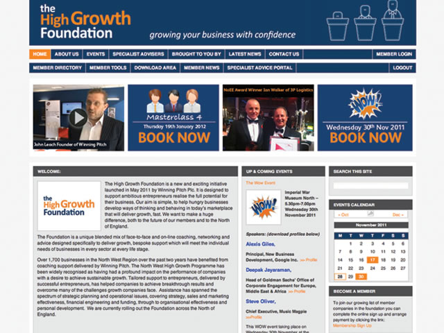
A dynamic and bold members pack was required that could be mailed out. A new website was also essential; one which they could update in-house and which would take them forward into the future.
Solution: We developed a modern, bold two colour logo that would be striking and cost effective. The emphasis on the word ‘growth’ was important and so this was made slightly bigger than the rest of the logotype text.
We then designed and produced the members welcome pack packaging, including space for book, USB and welcome letter.
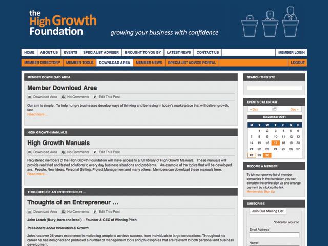
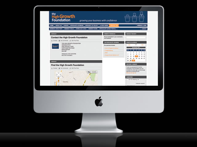
The website was developed as a content managed system, giving the High Growth Foundation team full control to update the website content in-house. The site needed to be bold but professional, innovative but functional, incorporating Social Media, Google Analytics to measure the response.


